PRODUCT DESIGN
38
Product Design
insurance that covers your stuff, anywhere, anytime.
brief
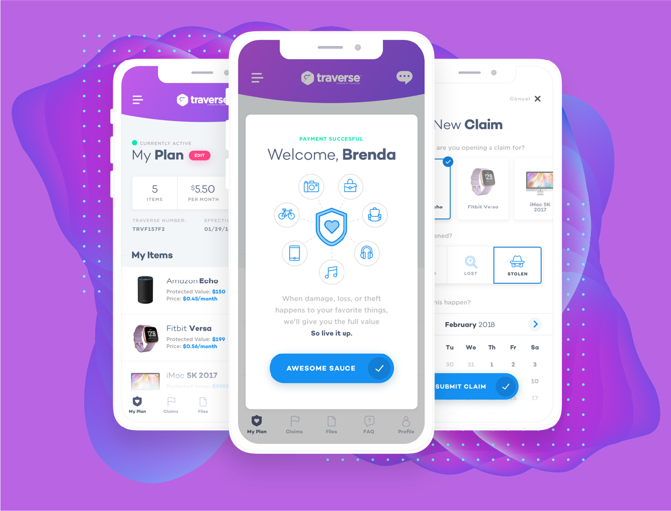
Based on testing and user research, a white space for an insurance product that follows you anywhere and protects your stuff, was defined. We were tasked with invisioning and designing what that experience would ultimately become.
solution
In an agile fashion, we designed, developed, and tested multiple approaches to acquiring and retaining new users. We focused on rapid prototyping and development in order to understand the market for a new product like this, as quickly as possible.
outcome
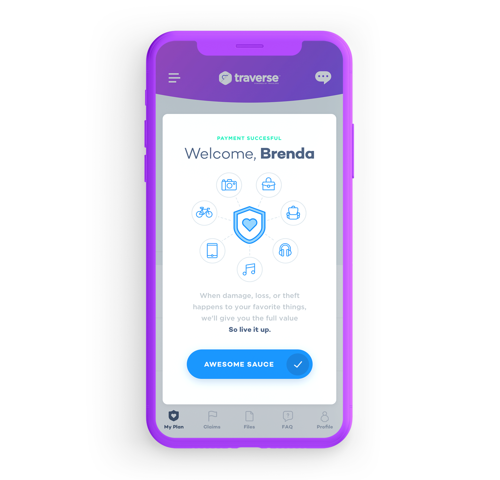
A new insurance product that truly let users protect whatever they wanted, all while following them in their lives. An insurance policy that followed you anywhere and protected youagainst damge, loss, or theft.
visual design
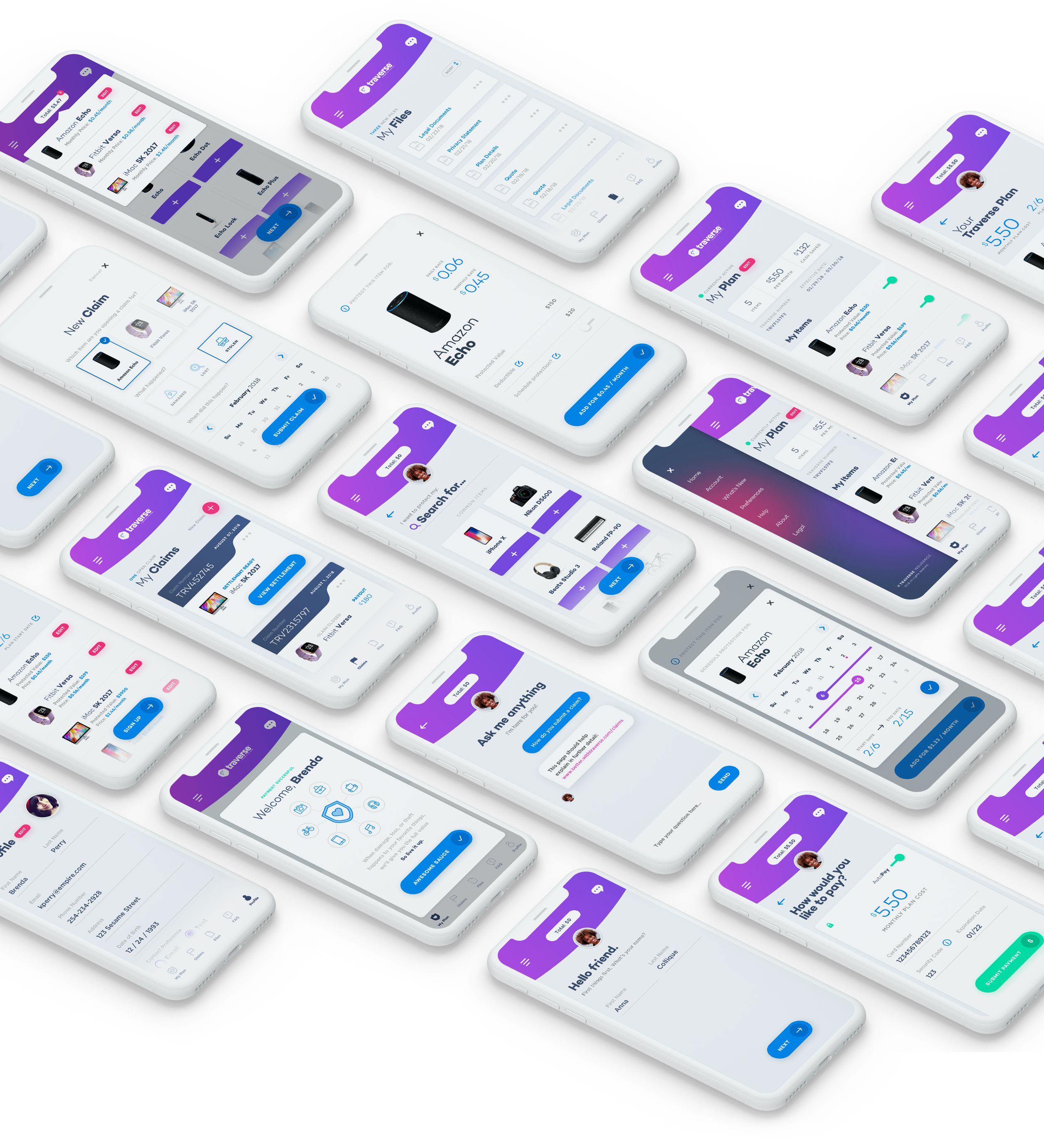
Through iterative Ux design decisions and findings, the Ui was evolved over time. The more we began to understand the user, the better the Ui became. The focus was on typography, beautiful imagery, and layout, which ultimately allowed for a visually appealing interface.
core feature
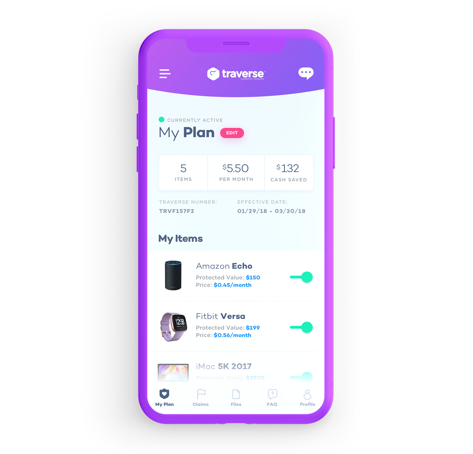
Users know what they own. So we designed a robust feature that would allow them to search for, and protect what they love most. This requires a continuously updated database of items in order to meet the demands of the customer, while providing a rich visual experience that feels ownable from a customers perspective.
low-friction
claims flow
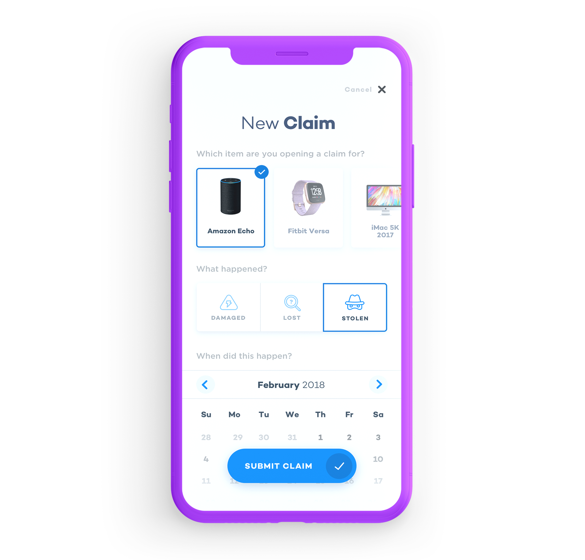
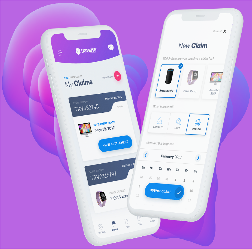
You just lost your precious belonging. The last thing you want to do is go through a super long and boring claims process. This simplified process meets the users demands by keeping the entire claims flow on one screen. Because claiming your beloved possesions shouldn't feel like a police report.
protection when
you need it
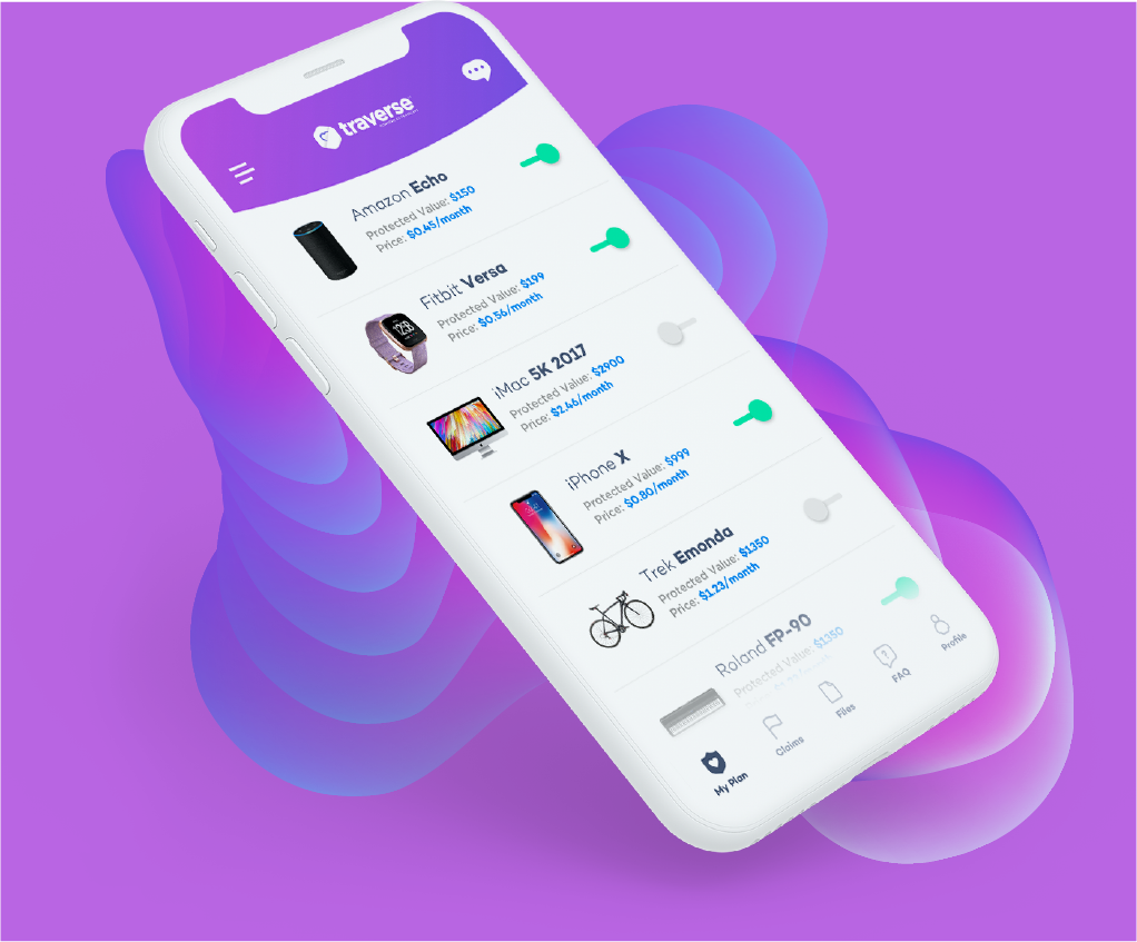
People don't always need protection for their items. Traverse was built with the ability to toggle on and off, when the user needs or doesn't need protection for certain items. This allows the user to be just as transient as they want with their policy.
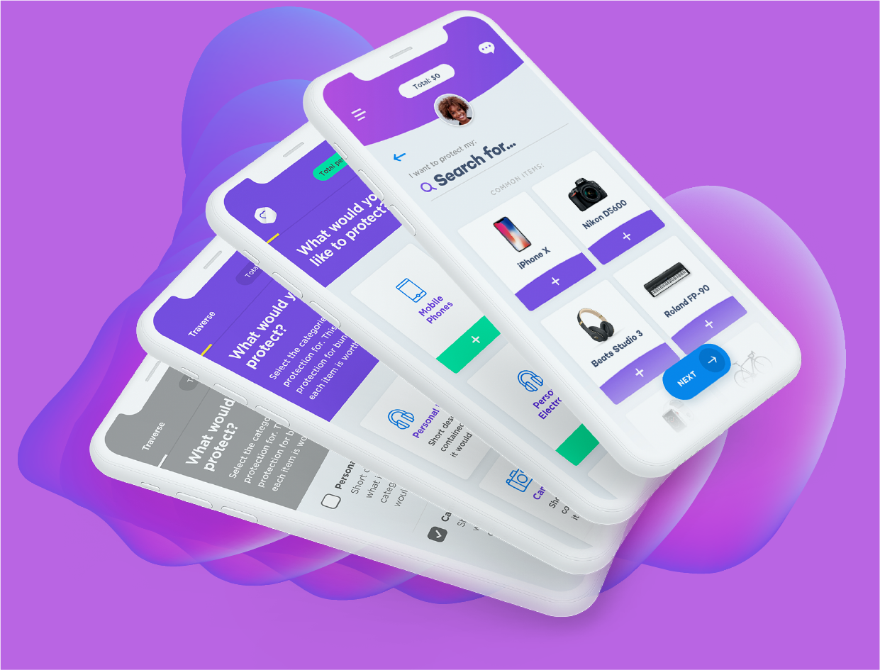
iterative ux approach
Starting with the core product and idea in mind, we designed a few key features while keeping in mind user feedback. Listening to what they were saying, we modified and adjusted the UX while still maintaining the core fundamentals of what the product should ultimately provide for users.


Atomic Design
46

Atomic Design
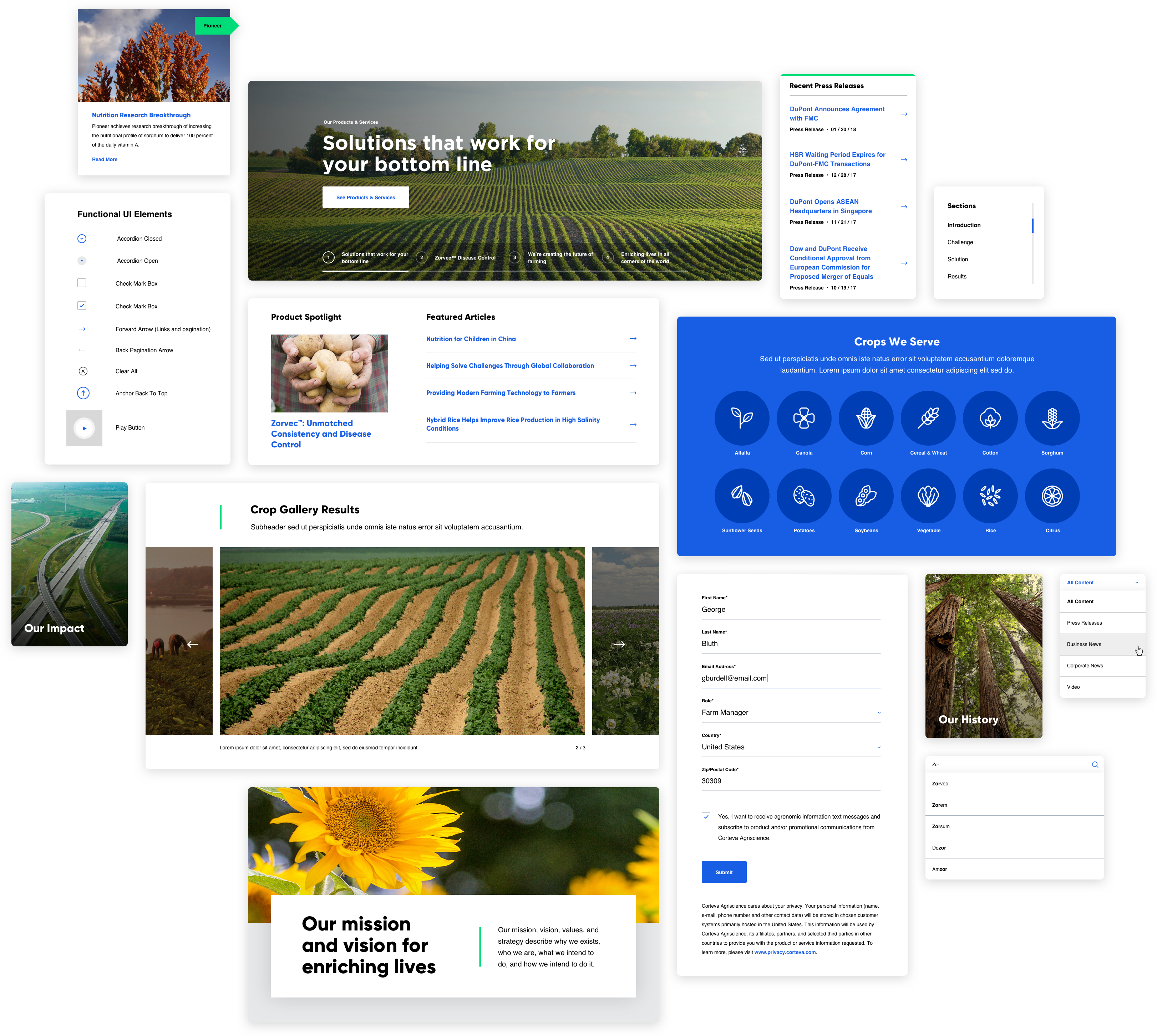
modernizing an agriscience web experience
Product Design
71
Product Design
transforming an age old insurance process

brief
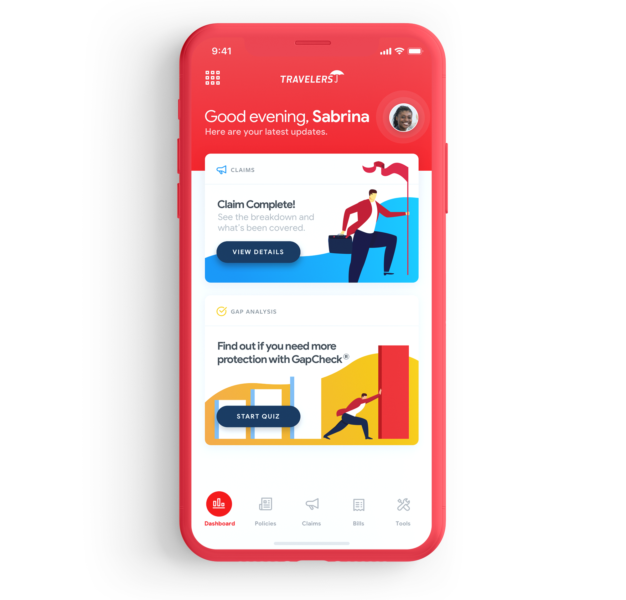
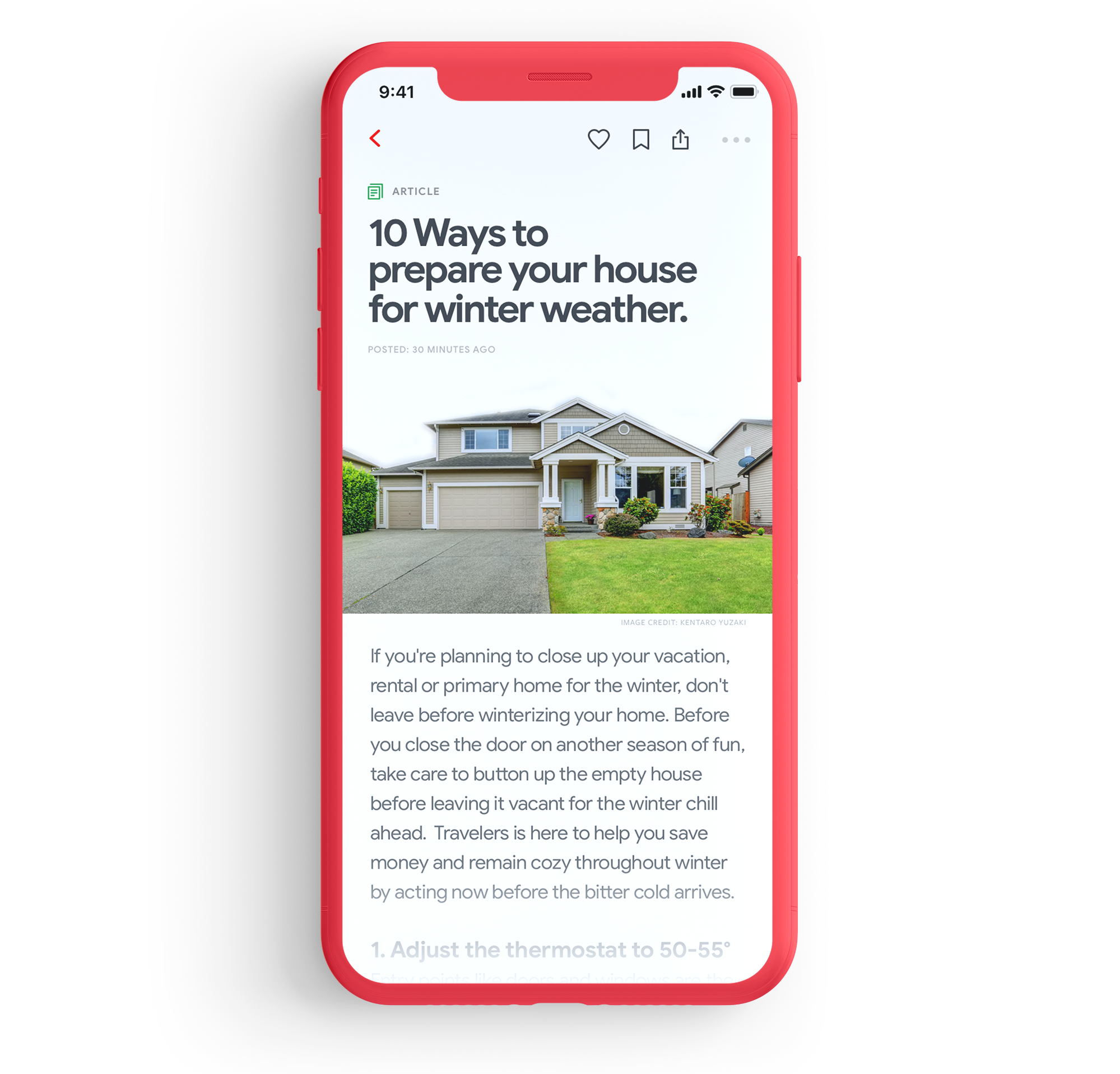
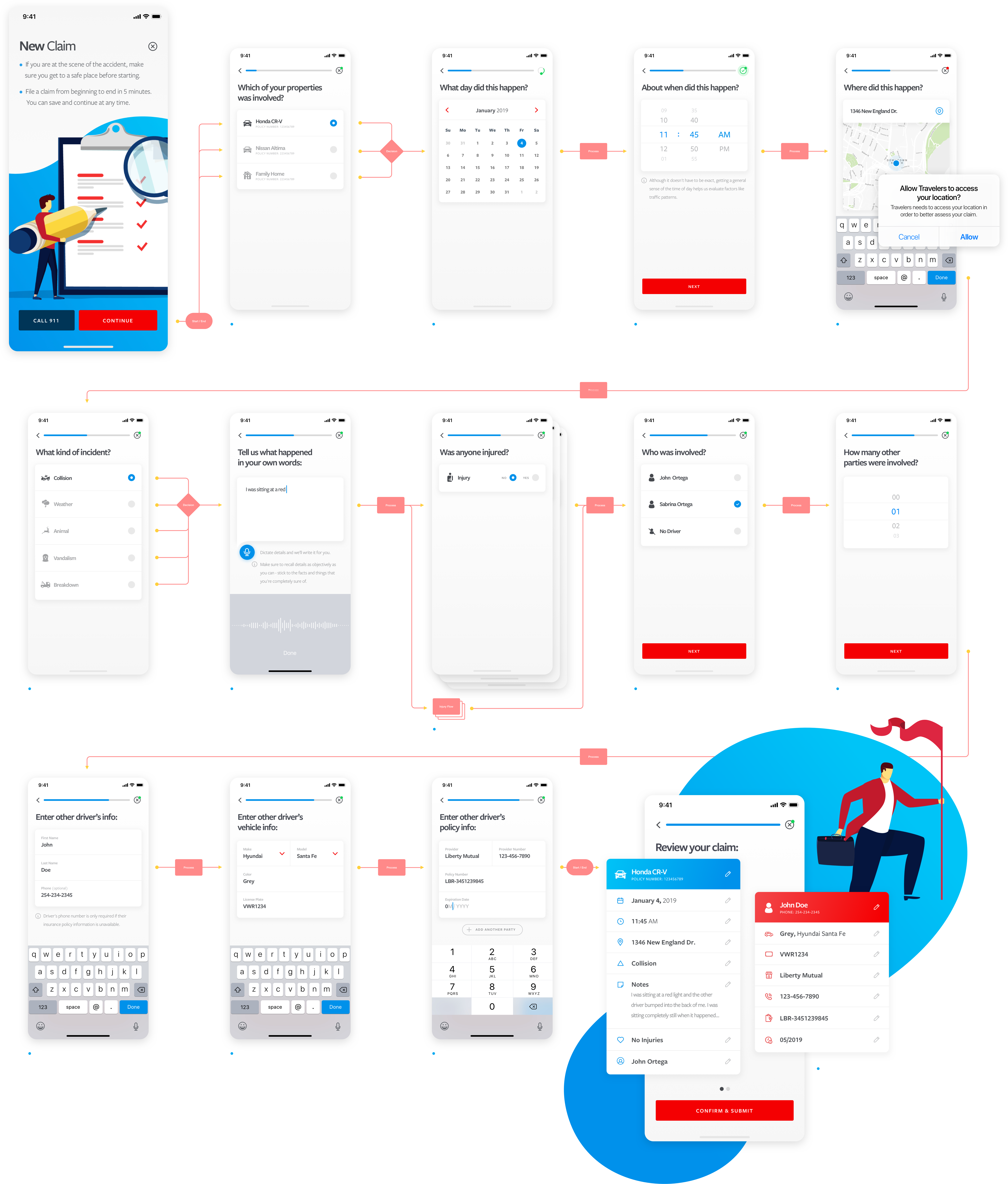
The lack of a true mobile product for customers, lead to the need for Travelers to design and innovate around their exisitng business model. Their user base was becoming ever more mobile, so we were brought in to align the company and major stakeholders on a path forward for what a rich Travelers mobile product could be.
solution
In working with the existing design team and system, we approached the product with a systematic/lean lens. Components and re-usable patterns were essential and reduced time needed for design. We went from paper to pixel, and at times, from client conversations to hi-fi concepts; all while taking into consideration existing infrastructure, business requirements, and potential partnerships we saw fit.
outcome
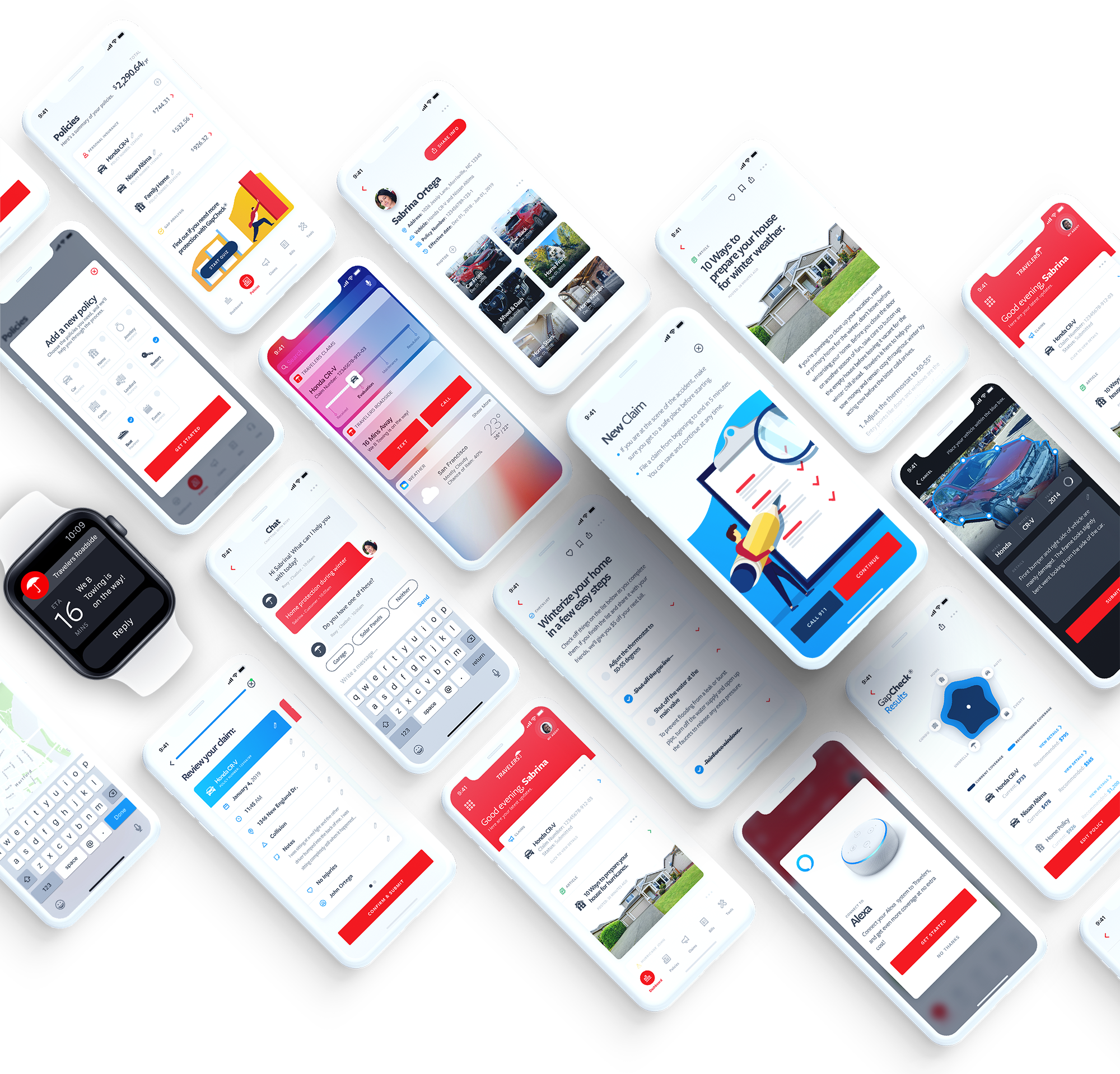
Over the course of less than a month, we designed 20+ components (2-3 sprints worth of work) and prototyped a future state version of both their Onboarding and Claims flow within the mobile app.
visual design
Since fonts, icons, and colors were already engrained within the Travelers brand, we were able to focus on the overall product and its offerings, while still maintaining a robust level of visual fidelity throughout the design sprints.
rich product offerings
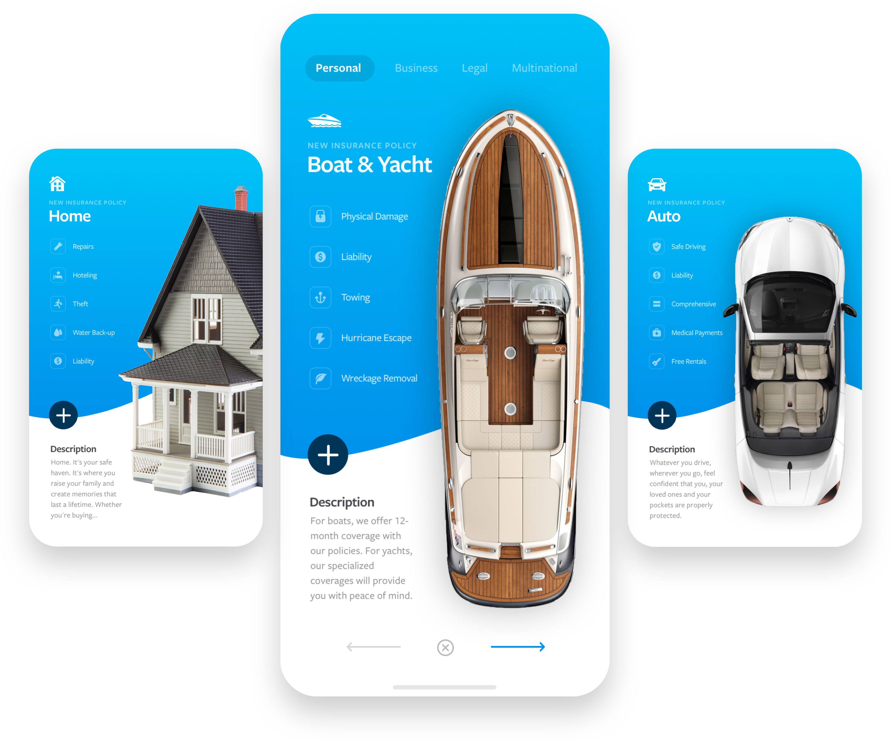
People love their things; and they love consuming information. We designed the product offerings to be more visually compelling and to showcase that the company cares just as much about people’s things as they do; all by breaking down the information into bite-sized chunks.
re-usable card components
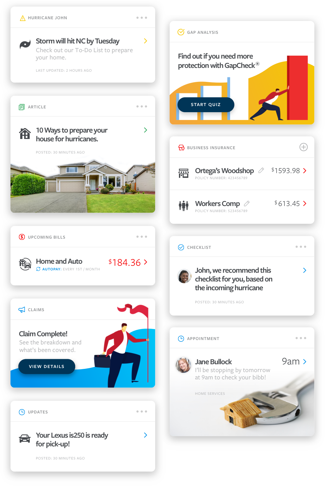
Personal information and data is unique to everyone. Because of this, we needed a system that would allow enough flexibility to make an experience feel custom to each user, while maintaining enough control to be able to develop, implement, and wield such a system.
Each card has multiple configurable options:
1) Card_Type
2) Card_Icon
3) Card_Background-Image
4) Card_Headline
5) Card_Subhead
6) Card_Options
7) Card_Details
8) Card_CTA
9) Card_Link-To
10) Card_Data
rapid, rinse, repeat
Through multiple design sprints, prototyping, and testing, we arrived at a high fidelity claims flow that was easy to use and quick to review and submit.

RE: ATOMIC DESIGN
51
RE: Atomic Design
implementing a brand at the atomic level

RWD • Product Design
18
Product Design
digital innovation for the affluent investor

brief
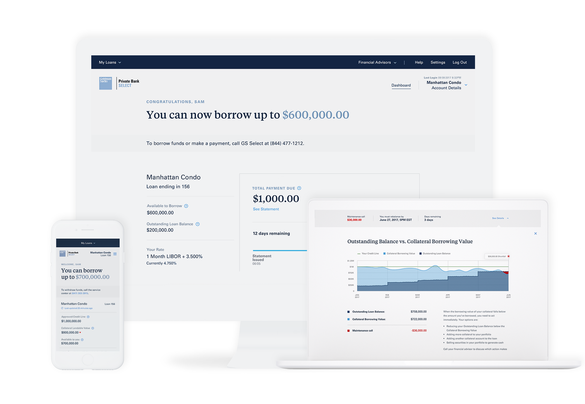
In a Lean design approach, we were given 3 months to design and produce a working prototype for a new service Goldman Sachs was launching for its customers. This product would allow for individuals to borrow funds by allocating their assets and valuable belongings as collateral in a type of loan called a Securities Based Loan.
solution
Working in a Lean fashion, we designed for specific scenarios that people would ultimately encounter. After a couple rounds of client approvals, we then took the sketch files and turned them into working responsive code and demo-ed that in front of the client.
outcome
After a couple of sprint cycles, we were able to produce 40+ scenarios worth of components and modules. Once the client approved the demo code, it was then pushed to the Front-End Dev teams in which they cleaned, packaged, and prepared it for production.
core feature
Users know what they own. So we designed a robust feature that would allow them to search for, and protect what they love most. This requires a continuously updated database of items in order to meet the demands of the customer, while providing a rich visual experience that feels ownable from a customers perspective.
Product Design
95

Product Design
mobile fuel delivery

STARTUP
95

Startup
creating an agile team
